SystemSix
![]()
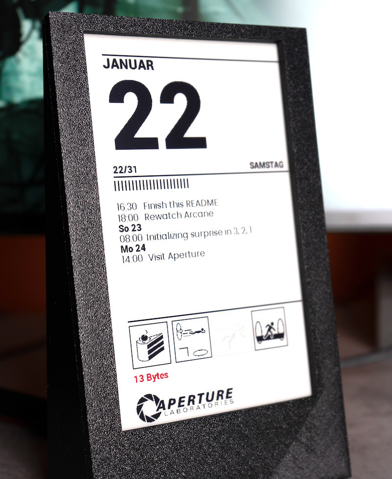
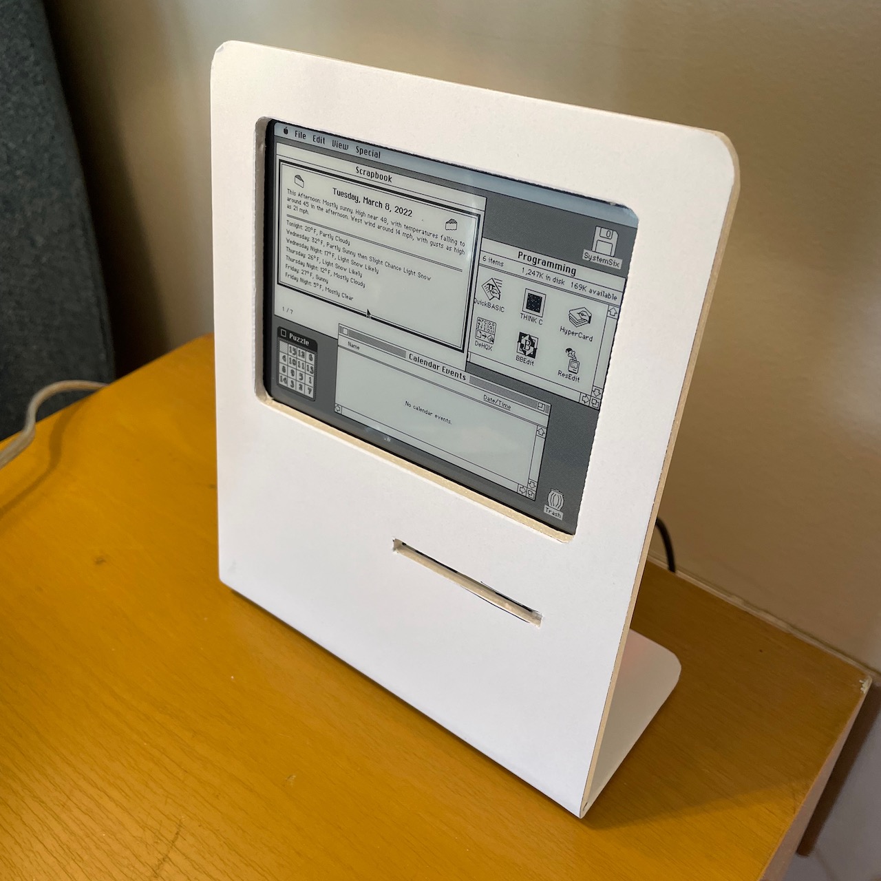
SystemSix is a desk calendar that displays the weather forecast and phase of the moon on an e-ink display. This is a kind of love-letter to my first Macintosh.
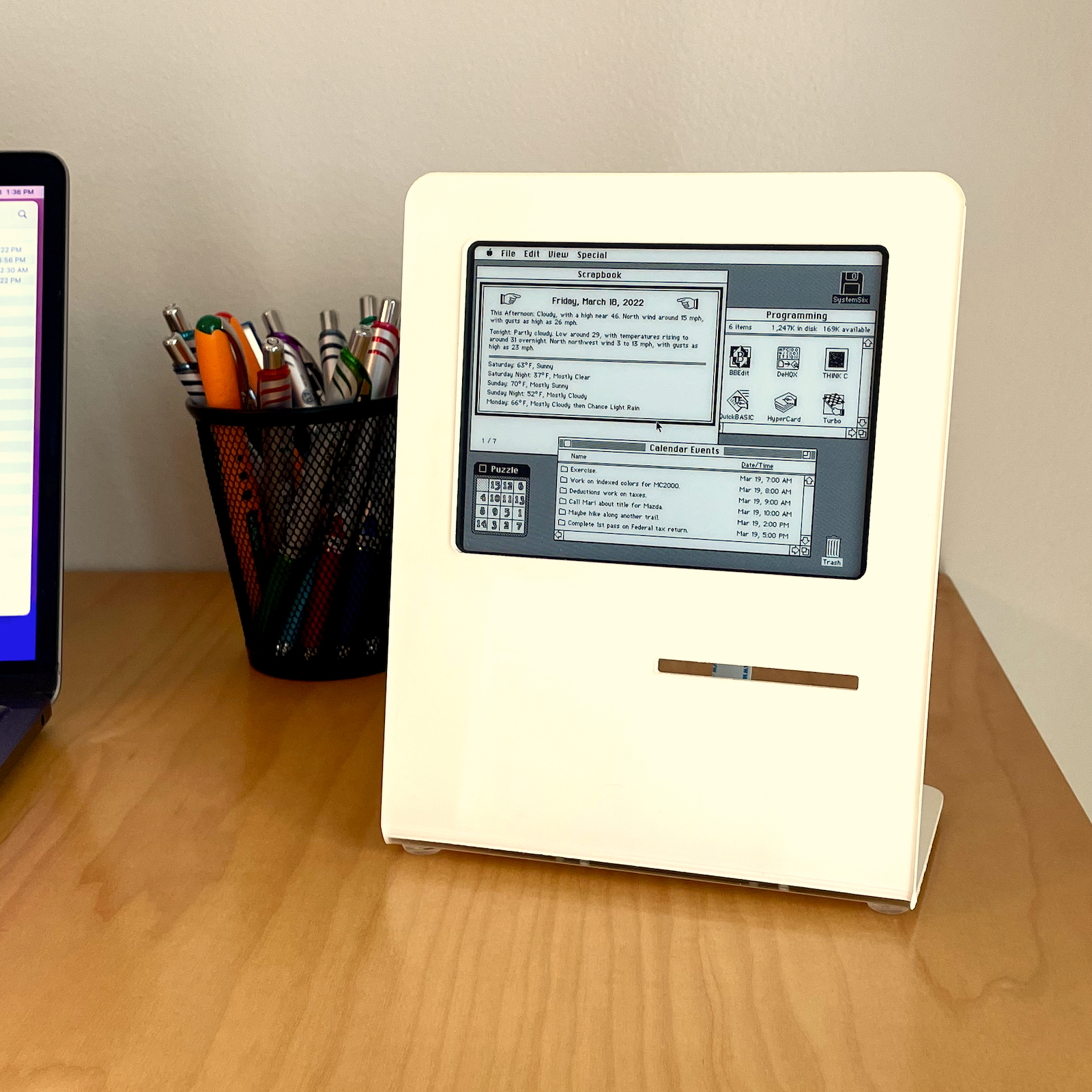
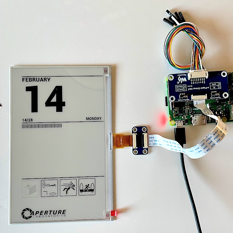
It's powered by a Raspberry Pi 3. The display is 5.83" e-ink display from Waveshare.
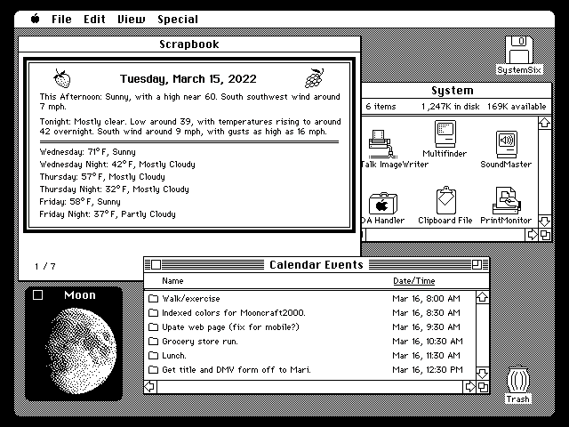
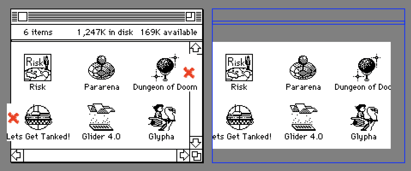
• If you configure it to point to a public calendar it will fetch the next six calendar events and display them (see below, the events are the folder names in the window in "list view").
• Configure your latitude and longitude in the settings and it will fetch the local weather forecast (see below, being displayed in the Scrapbook).
• In the evening SystemSix displays the current phase of the moon (see below, looking like a "desk accessory" in vintage-Mac parlance).
• The trash icon is displayed "full" on the day of your choice (for me it's Monday, to remind me to take the trash to the curb for Tuesday pickup).
To be clear, this is not an interactive application. It looks like a computer display you could click on or touch the screen of, but it is quite static — only displaying your calendar events and the weather forecast in a retro, computer-like interface.
The source code is written in the Python scripting language and is available on my GitHub page.
The README.md file on GitHub explains in more detail how to install, run and configure the software to get your local weather data and to use your public calendar.
The display stand is laser-cut from 3mm acrylic. I used a strip heater to put the single bend in the acrylic so it would stand up (leaning slightly back). The Raspberry Pi and e-ink display are mounted from behind. If Raspberry Pi 3's were available, you could build the thing for roughly $100 USD.
What follows is the process I went through, tricks I learned along the way, to arrive at SystemSix.
Wonderful E-Ink
E-ink displays are fascinating things. A small Kindle was the first device that I saw that had one of these odd displays. I was amazed at how they "stayed on" even while the power was off. My first thought was that perhaps they drew so little power that the Kindle could send them just a trickle to keep the pixels on. But no, it turns out that once activated, e-ink pixels stay white or black whether powered or not.
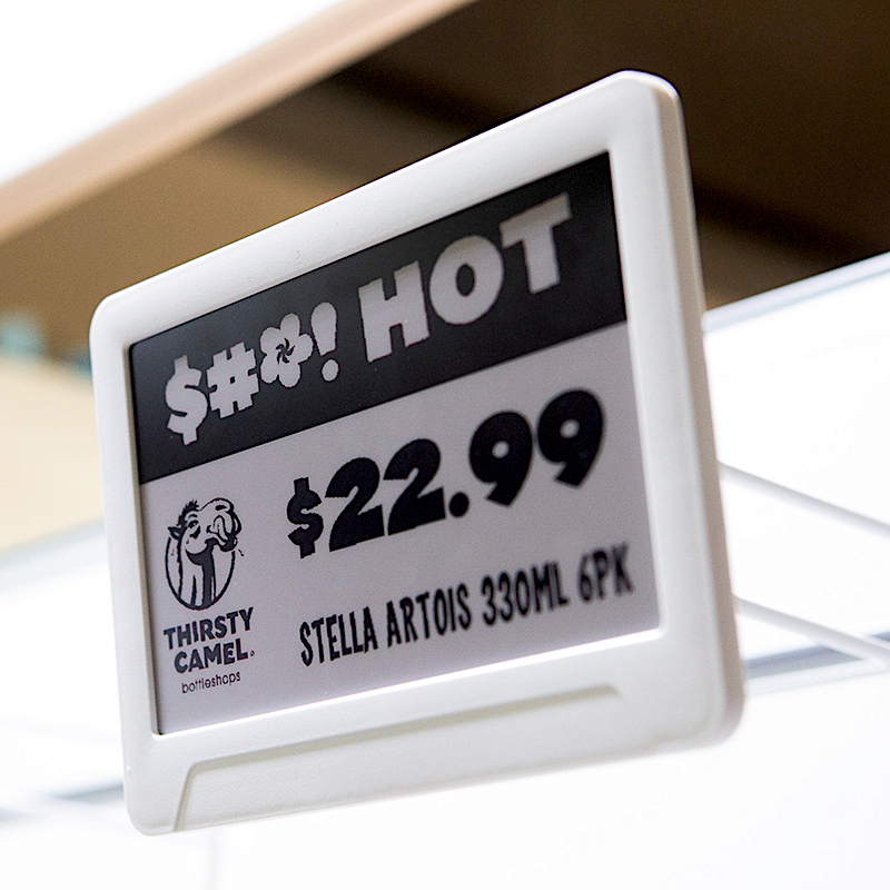
Now that I know what to look for, I often see e-ink displays acting as price tags on things like refrigerators on display at big-box stores.
Their clarity in daylight, and almost paper-and-ink-like appearance attracted me to them. Cool things. I wanted to get one of my own and try my hand at putting my own pixels on them.
Horrible E-Ink
But something that I found obnoxious about e-ink displays (and I noted this even with that first Kindle) was just how hideous and drawn-out the refresh of the display was. Wow, it's bad.
If you haven't seen one in person, there is a sequence of flashing, image inverting, and more flashing. It can be half a minute before the panel finally settles down to display the final image. Absolutely unacceptable for any sort of animation or scrolling.
I have read that more sophisticated (expensive?) e-ink displays (or their drivers?) are capable of partial updates — that is, I believe, the flickering/flashing can be limited only to the portion of the display that needs updating. I have not experimented with these displays however.
I have also heard some modern commercial "book reader" products that use e-ink displays have much faster refreshes now. Perhaps in time this liability will evaporate (and also for the fairly inexpensive hobbyist panels). Until then, we must live with e-ink's limitations.
Newspapers, Calendars
The best applications that I have seen for e-ink displays is to display calendar or weather data, or (on large expensive displays) something resembling the front page of a newspaper that is a digest of the day's news. These seem like a good match for e-ink.
Oh, another limitation I forgot to mention: e-ink displays are generally only black and white. And when I say black and white I do not mean grayscale — they are literally 1-bit displays: a pixel is either on or off.
Three-color displays (black, white and red for example) are about as inexpensive as the black and white e-ink displays. There was even recently released a seven-color e-ink display. I spent a little time experimenting with a three-color display and it was … just okay? I guess it taught me to keep my expectations in check with regard to e-ink advances in color.
Regardless, the projects I described above, calendars and newspapers, are well suited to a black-and-white-only display. When in the course of internet browsing I came across a rather inexpensive and well-documented calendar project, I decided to purchase the hardware and experiment with the software.
eInkCalendar
13Bytes (the name of the author's GitHub account) created a simple and elegant e-ink calendar called, originally enough, eInkCalendar.
Written in Python; I would be as new to the language as I was to e-ink displays. His code runs on a Raspberry Pi with the e-ink display attached with a "hat" to the GPIO pins. I did have at least a little experience with the Raspberry Pi and was soon, after all, able to get 13Bytes code up and running with the e-ink display showing the date (and bits of artwork from the video game, Portal).
Hello, e-ink world!
Ship Refitting
I'm not a very smart programmer. A smart software engineer, new to Python, would crack a book or pore over documentation on the Python language. Instead, I tend to amble into something new by finding a small program and then I can remove a line of code, add a line, move something around. If something breaks, I put it back the way it was.
If I ever do figure out how a thing actually works, I tend to keep going through the code in this way, refactoring it (learning more) as I go. In the end it can happen that, like the old wooden sailing ships, eventually little is left of the original and we have effectively a new program. (Well, kind of.)
The first planks I tore up were the "Portal" artwork. In their place I thought something showing the current phase of the moon, graphically, would be cool.
To display the moon in 1-bit (literally black and white) I thought back to my early Macintosh days. My first Apple computer was a Macintosh Plus — a machine also sporting a crisp, 1-bit display. The college I attended had a flat-bed scanner (cool!) attached to a Macintosh. The software driving the scanner would convert the scanned image to black and white by dithering the image.
The algorithm to do the dithering was no doubt Bill Atkinson's. Root around the internet and you will find web sites that can do the dithering in-browser. You upload an image and can select the color palette and the dithering algorithm you would like.
I found some nice photos of the moon in various phases online, uploaded them to be Atkinson-dithered and was pleased with the result.
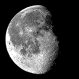
But something odd happened on the way to re-skinning the eInkCalendar. When I saw the wonderful Atkinson-dithered moon I was taken back to the 1-bit beauty that was my first Mac Plus. I imagined the dithered moon as some sort of "desk accessory". Instantly I re-imagined the entire e-ink calendar as a psuedo-Mac desktop with a Moon desk accessory — perhaps calendar events displayed as the names of folders in a Finder window in "list view"… This app could double as a fond trip down memory lane.
As an aside, I, and a few coworkers, were fortunate to have been invited to Bill Atkinson's home one afternoon over a decade ago when I was an engineer on the ColorSync team at Apple. There's not a lot to tell but perhaps I can recount it sometime in the future if anyone is curious.
1-Bit Art
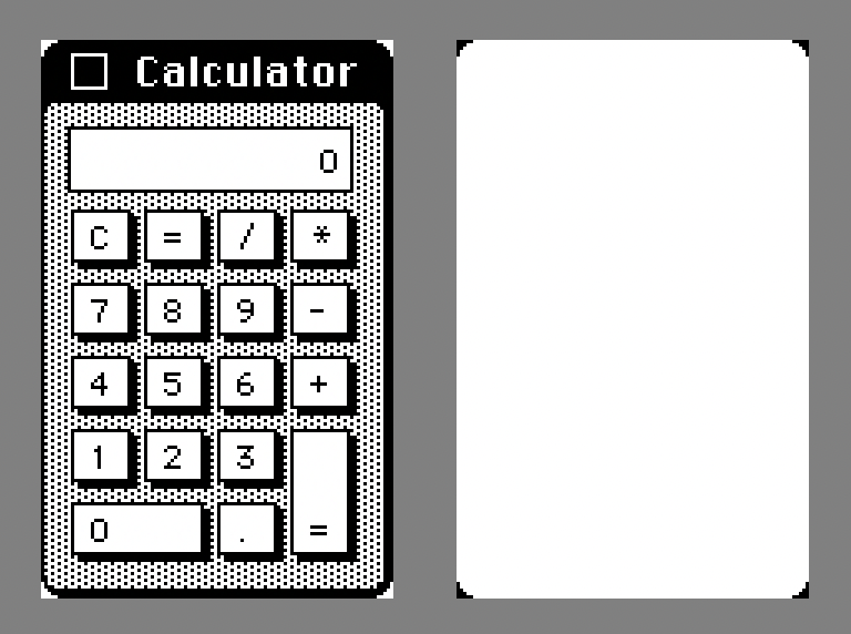
I would need menus, windows, icons as the artwork for the project but, surprisingly, the internet is not exactly flush with pixel-perfect screenshots of various aspects of the early Macintosh operating system.
Fortunately I had experience playing with the excellent Mini vMac Macintosh emulator. It was with the emulator that I was able to get most of the source artwork that I would later tweak in Pixelmator.
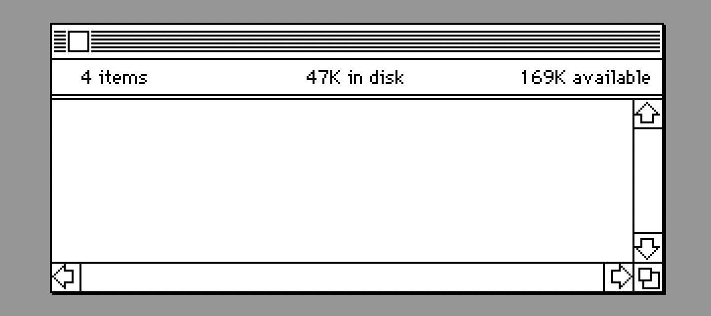
Since the contents of things like the windows was going to be dynamic, some of the edits I did were to remove icons and even remove the titles of the windows. The Python code would later render icons in the window, add a suitable window title.
Curiously, screenshots of the emulator running on my MacBook Pro were "retina" quality. This meant they were essentially pixel-doubled — twice as large and tall as the actual pixel representation on the Mac being emulated. Normally, downsizing such an image, even by 50%, will result in a blurred image (esoterica: image applicaitons might use something called a Lanczos filter to downsample the image resulting in the sort of blending of pixels) — no longer a pixel-perfect representation of the emulated Mac.
I discovered the wonderful, cross-platform GraphicsMagick
command-line tool that allows for various image sampling filter options when you instruct it to resize
an image. Further, it can be run in batch mode. For my case -filter Point was the
magick parameter. It scaled down my screenshots without the Lanczos filter resampling or whatever.
My workflow was to first spend time taking screen-grabs of the emulator showing various user elements.
When I had a folder of these, I would cd into the directory of screenshots and execute
the following script in Terminal:
		for file in *.png

		do

		  outfile=`basename $file .png`.bmp

		  echo convert -verbose "'$file'" -filter Point -geometry 50% \

		  +profile "'*'" "'$outfile'"

		done | gm batch -echo on -feedback on -
The result was a number of .bmp files scaled down 50% — precisely matching the
original Mac.
Having the UI elements in pieces (like the window image above) meant the software could create a new desktop dynamically, programatically every time it is run or updates. In fact though, a good deal of the tedium was playing around with the various UI elements in Pixelmator, trying to come up with a pretty composition that would also give you calendar events, a weather forecast, the phase of the moon.
That done though, I could take measurements within Pixelmator (get the x and y offets from the origin) and translate these to Python code. Essentially: draw "window.bmp" at location (312, 110), for example.
The e-Ink display I used has a resolution of 648 x 480 pixels (not a typo: 648). This is already a good deal larger than my original Macintosh Plus's 512 x 342 pixels.
I considered using the entire 648 x 480 display for the desktop, at the risk of course of upsetting the purists. When I displayed content right up to the physical edge of the panel however I found it was not going to be practical to create a bezel for the display and perfectly align it in such a way as to hide the metal trim of the e-ink panel.
So I decided to pad (letterbox) the display with a black border — affording me a bit of slop with the acrylic bezel. It was tempting to pad down to the Mac's 512 x 342 (yay, purists!) but I decided against it. The physical panel is already quite small and to try and display calendar + weather in a pleasing way would have been quite constrained. (Spoiled by our big computer displays in the 21st Century.)
So I ended up with some sort of odd 608 x 456 pixel desktop.
Layouts
To make the desktop a little more interesting from day to day, I thought it would be fun to have more than one configuration — try and mix it up a bit each day. I knew I wanted to sometimes show a desktop folder with "classic" icons. There are so many icons to choose from that I knew I could randomize the folder icons from day to day and would be able to occassionally surprise and delight the old-time Mac user. But I wanted to change it up at a higher level as well.
To that end I came up with three different "layouts". The Finder + Scrapbook layout is currently the one that I display most often. There are two more primary layouts though that are displayed with less frequency: a "word-processor-based" layout and a "paint-program-based" one.
If I revisit this little app I would love to add more layouts. It's a bit of a challenge though when you consider that you still have to display useful information: your calendar and weather data. Also, no animation. Nonetheless, I can see Hypercard making an appearance, perhaps a couple variations on the Finder desktop without the Scrapbook, but other familiar UI elements instead. I have screen-captured a few of these screen elements in order to experiment with in the future.
A few other things: one fun idea that occurred to me one day was to make the trash icon show full sometimes, empty others. Since "trash day" where I live is on Tuesday, I liked the idea of having the trash icon displayed full on Monday, the day before, to remind me to take the trash to the curb in the evening. You can of course configure the trash to be full on other days.
Since, as I suggested, desktop real-estate is precious, I decided to only display the Moon-phase desk accessory in the evening — freeing up that bit of real estate during the day for other things.
PIL(low)
In addition to being my introduction to Python, this project was my introduction to PIL (Python Image Library) as well. Pillow appears to be the popular fork of PIL. As I am new to it, I will not pretend to speak with any authority but I will make mention of some of the issues I encountered, solutions.
The workflow for getting pixels on the e-ink display appears to be:
- Create an image, a "canvas" so to speak with width & height matching the display.
- Render your artwork to this image until you have your "desktop".
- Instruct the e-ink driver to display this final image.
For the first two steps, Pillow is used.
I mentioned that a good deal of time was required simply procurring artwork, converting, and editing the assets. Assembling, rendering these into a cogent desktop though was fairly straight-forward with PIL.
Something I had to discover however was how to render an image with a mask. Some of the UI elements, like a window with rounded corners, would have rendered with square corners filled in without a mask. It turns out that masking is easy with PIL, you provide a second image where white pixels indicate pixels in the source image that will be copied, black pixels in the mask indicate which pixels from the source image to skip over.
Even some of the simpler, rectangular windows might have a single pixel in two of the corners that needed masking out.
Displaying the weather forecast (lots of text) proved a slight challenge as there is no API in Pillow that handles wrapping text for you. Someone on StackOverflow had a solution and I include it in the sources.
A bigger challenge was handling the display of application icons in the "icon view" window. The icons are generally as wide as their titles and some of the appplications have quite long names. I wanted to display the icons with a regular stride — say 72 pixels or so. But displaying two of these wide icons next to one another would cause the last icon drawn to partially cover the previously drawn one.
I did not want to 1) shorten the titles of the icons 2) space them apart to avoid overlapping or 3) let them overlap.
I wanted to 1) leave the titles as is 2) keep them a fixed distance apart to look nice and 3) stagger them vertically instead.
Staggering vertically solved the layout issue but would still leave the problem that the last one drawn could stomp white pixels over the previous icon drawn. A solution would be to use a mask with the icons as I did with the window elements. My annoyance with masking was that I had already 132 icon assets and did not want to have to also create 132 masks.
Instead, I found that you can also clip an image with Pillow. Therefore, I could create a mask for the widest icon and reuse that same mask for all other icons as well by clipping a little off the left and a little off the right to match the icon size in question.
The last challenge was figuring out how handle the scenario where a wide icon might hang too far over the left or right edge of the window … either clobbering a scrollbar or hanging out over the desktop.
The solution I found here was even simpler. I created an image exactly the size of the content of the window and rendered the icons there. If they hung out over the edge of the image they would naturally get clipped off. The final step was to paste that (now icon-populated) image in the exact correct position on the window.
If there is a way to specify a clipping region on an Image in Pillow, I did not come
across it (may not even have looked for it since I thought of the above solution so quickly).
Display Stand
I picked up a fairly inexpensive strip heater for bending acrylic a year or so back. I had previously built my own from a power-supply + Nichrome wire but it was a little janky. They are simple things that you plug in and lay a piece of sheet-acrylic across. They heat and soften the acrylic allowing you to put a bend in it.
So for the display/stand for my SystemSix set-up I decided to go with a laser-cut piece of acrylic with a slightly greater-than-90-degree bend to give it support to stand upright.
The excellent Affinity Designer was used to layout the cuts. Before ordering a fairly expensive laser-cut part online though I like to prototype the design at home as best I can. For this I printed my design to a printer and Super-77'ed the print-out to a sheet of foam-core. Using a sharp hobby knife (scalpel actually) I cut along the print lines and assembled my display stand.
When happy with the result, I exported the design as an SVG file and uploaded to Sculpteo. They're not cheap (I think I had to order like four of the stands to get past their minimum-order-to-avoid-a-handling-fee threshold). The result you can see at the top of this post.
The SVG files I also include in the GitHub repo. One of the files includes the "bend line" and is not the file you want to send to Sculpteo. Holes in the display are for mounting either a Raspberry Pi 3 or a Raspberry Pi Zero (I did not try the zero though).
Conclusion
I'm happy with this project. It satisfied both my curiousty about e-ink displays and Python as well as rekindled fond memories for the early Mac. There's plenty more I can do with this though. I mentioned already that there are a number of "layouts" left still to implement like a Hypercard layout or two. I also got screenshots for potential layouts of an install in progress, KeyCaps, a print panel, Chooser, etc.
Never mind all the game layout possibilities: Gun Shy, various solitaire card games just to name a few.
And too there is more work that can be done for the modules like weather, calendar. For myself, I'm more of a "Reminders" guy rather than a "Calendar" guy but I was unable to get a Reminders API to work.
The weather API I chose was easy and required no account/token. But I have found it unreliable in my particular area at least.
I want to finish by expressing the joy I have had in recalling those "simpler times" when the Macintosh was new and I was new to programming it. Even the computer itself was simpler then — no gauntlet of passwords, for example (unless you count the occasional dialing up of BBS's using my Migent Pocket Modem using the Red Ryder shareware app).
Hopefully others too will feel a bit of nostalgia from this project.

Found this interesting or useful? Buy me a