Experiments in Printmaking, Part 1
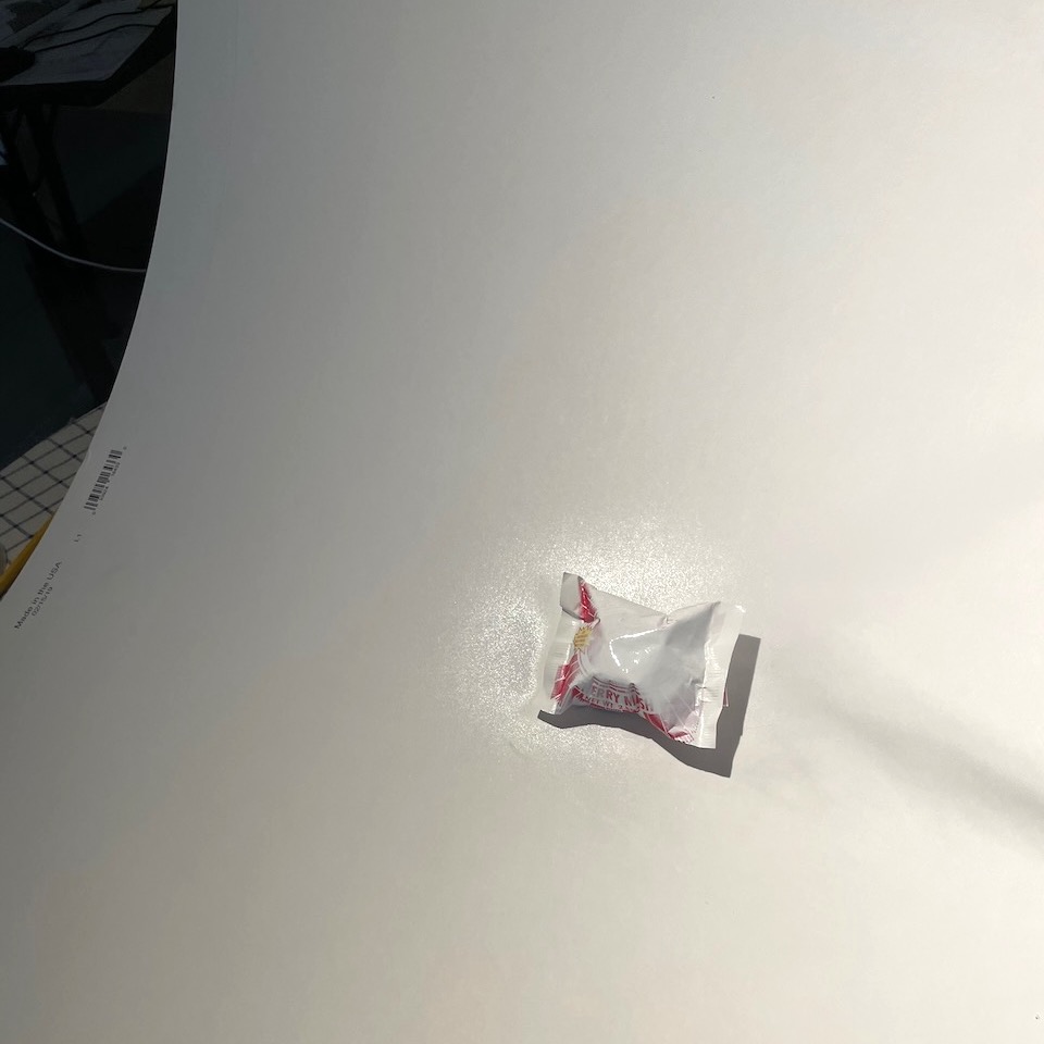
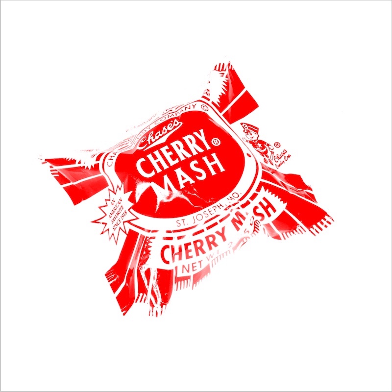
Cherry Mash
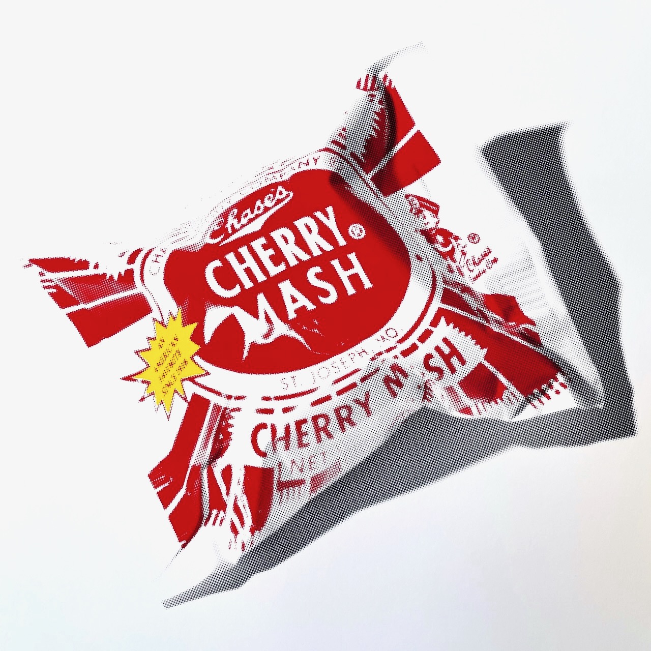
The effect I am going for with the Cherry Mash piece is a pop-art (Warhol-esque) print of the candy, reduced (posterized) to just three colors (red, yellow and black) and with obvious half-toning.
The result is above, and I am more or less happy with the result. Printed roughly LP album sized (13” × 13”) on my Epson inkjet, it looks pretty cool.
I decided to try a few experiments with regard to capturing the image and separating the colors and I ended up printing the image in an unorthodox manner. Some things worked well, other things not so much. I’ll describe the process here.
Chroma
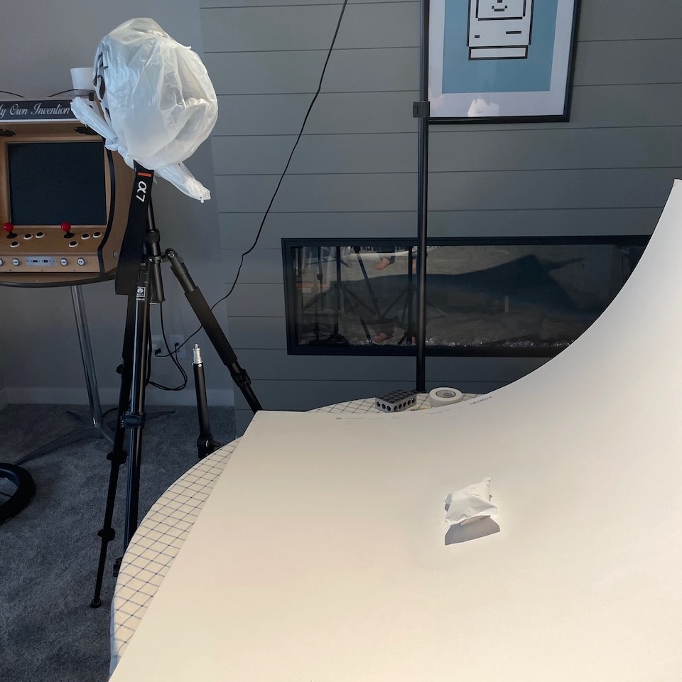
The set up is pretty straightforward. I have the Cherry Mash stuck down on a large piece of white matte board. I have a digital camera on a tripod shooting through a ring light. The idea was to try to photograph a fairly flat image of the Cherry Mash but one that would give ample exposure to the chroma (color) features. I’ll explain later why I think this approach ultimately was a mistake.
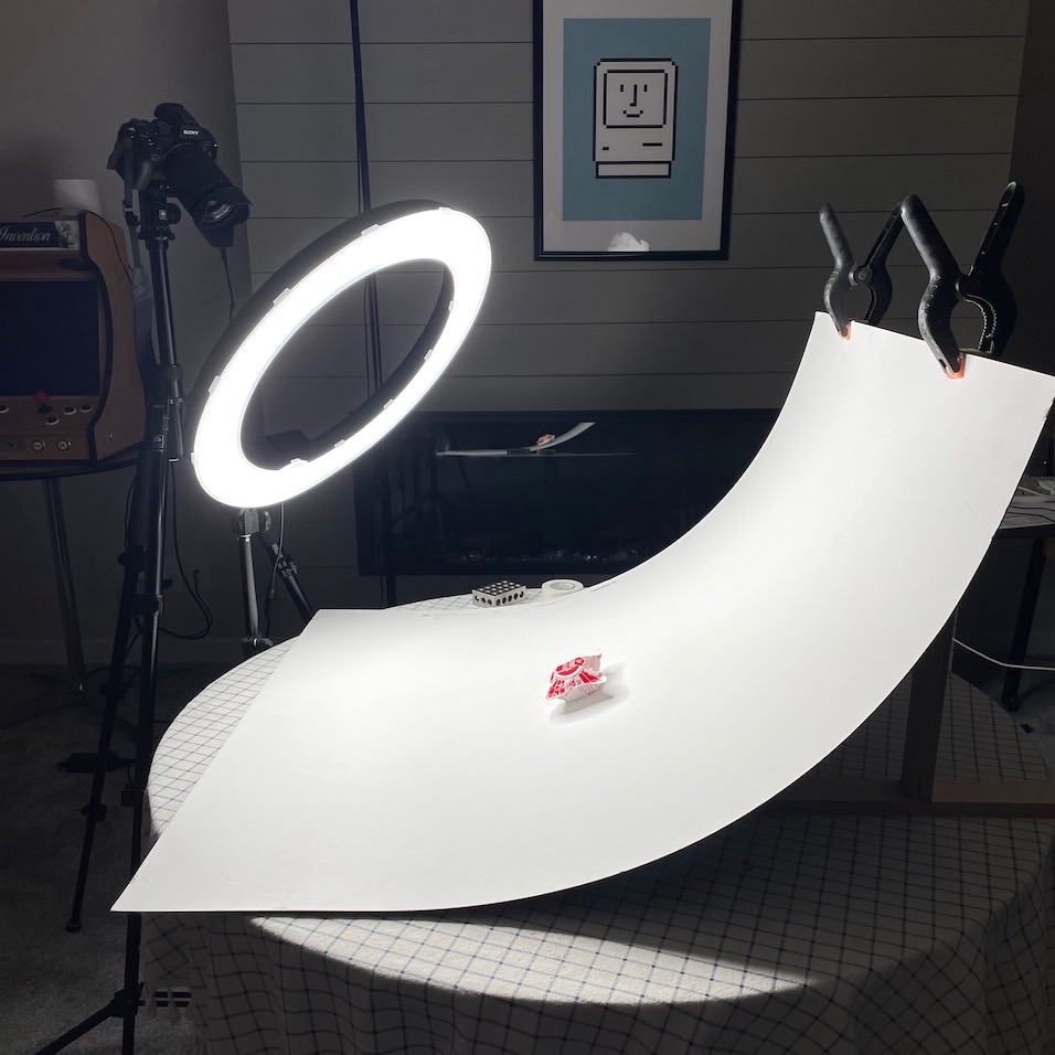
What I have not yet explained is that I intend to take a second photo with “proper” lighting (real shadows and such) which is intended to represent the luminance (shadows, lighting) of the Cherry Mash. My thought was that to capture color and luminance separately, two different photos could be shot differently to better serve each purpose.
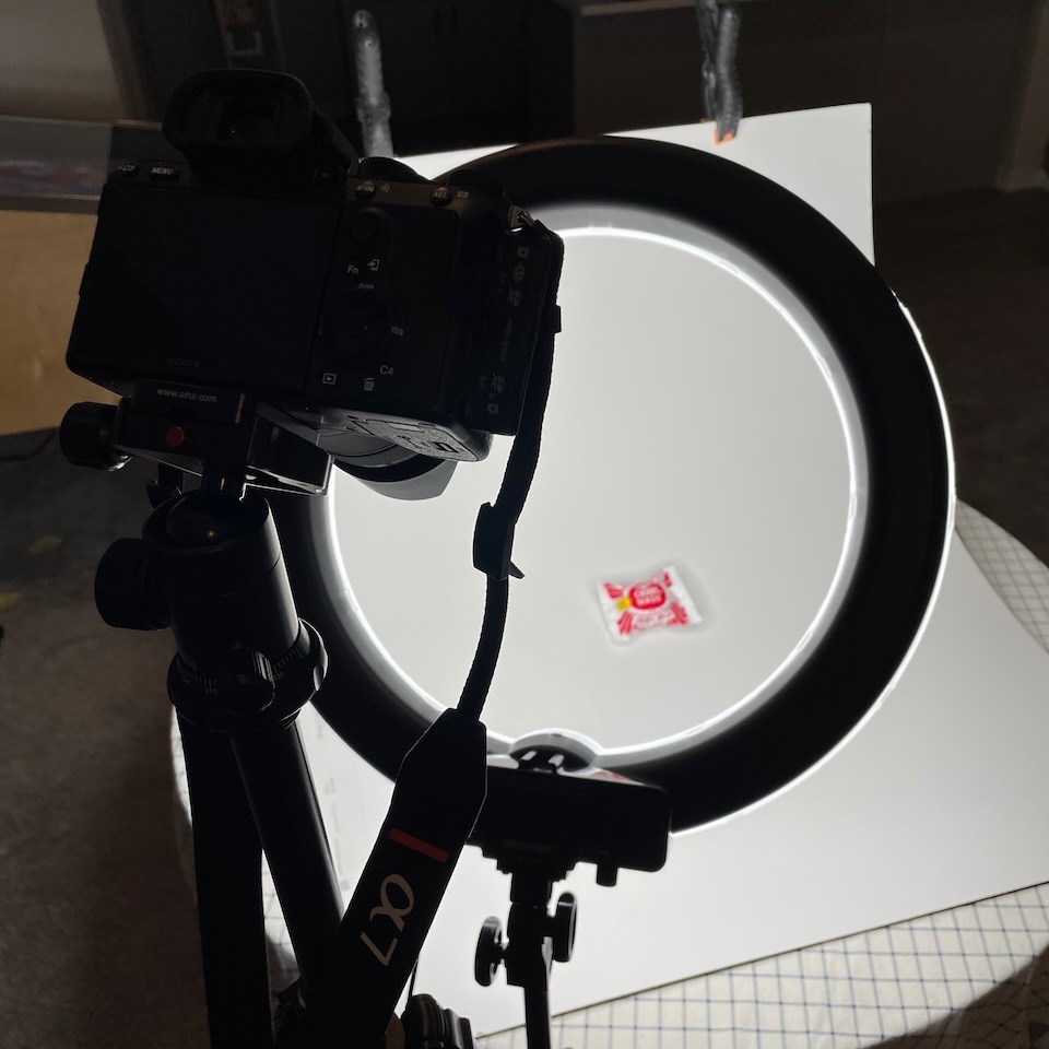
Before we get to that step though, here are some photos with the above setup where I bracketed (going both plus and minus on the exposure bias setting of the Sony camera).
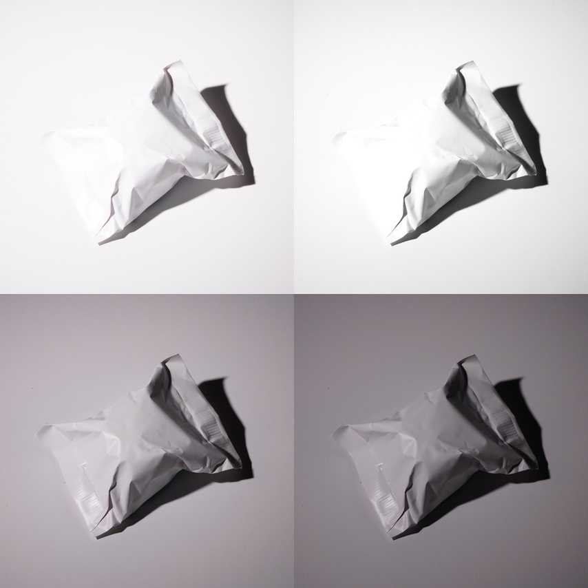
Luminance
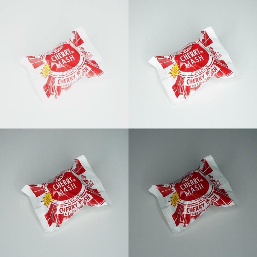
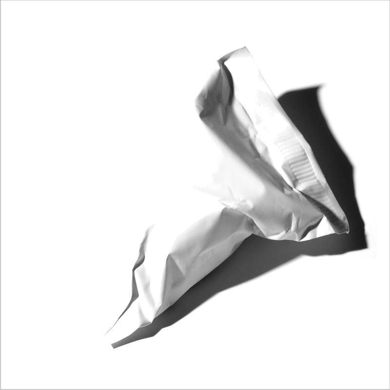
It was important not to disturb the setup for the next step — this step would be to capture the luminance, the shadows. The unorthodox way I went about it though involved first spray-painting white the Cherry Mash in situ.
The point of painting the Cherry Mash white of course is to get rid of all color.
Again, I am bracketing the exposure for the luminance capture. (By bracketing, I get a variety of images to choose from when later trying to clean up in post. Too dark and I have a hard time removing the background, too bright and the detail on the subject can be blown out.)
Working in Post
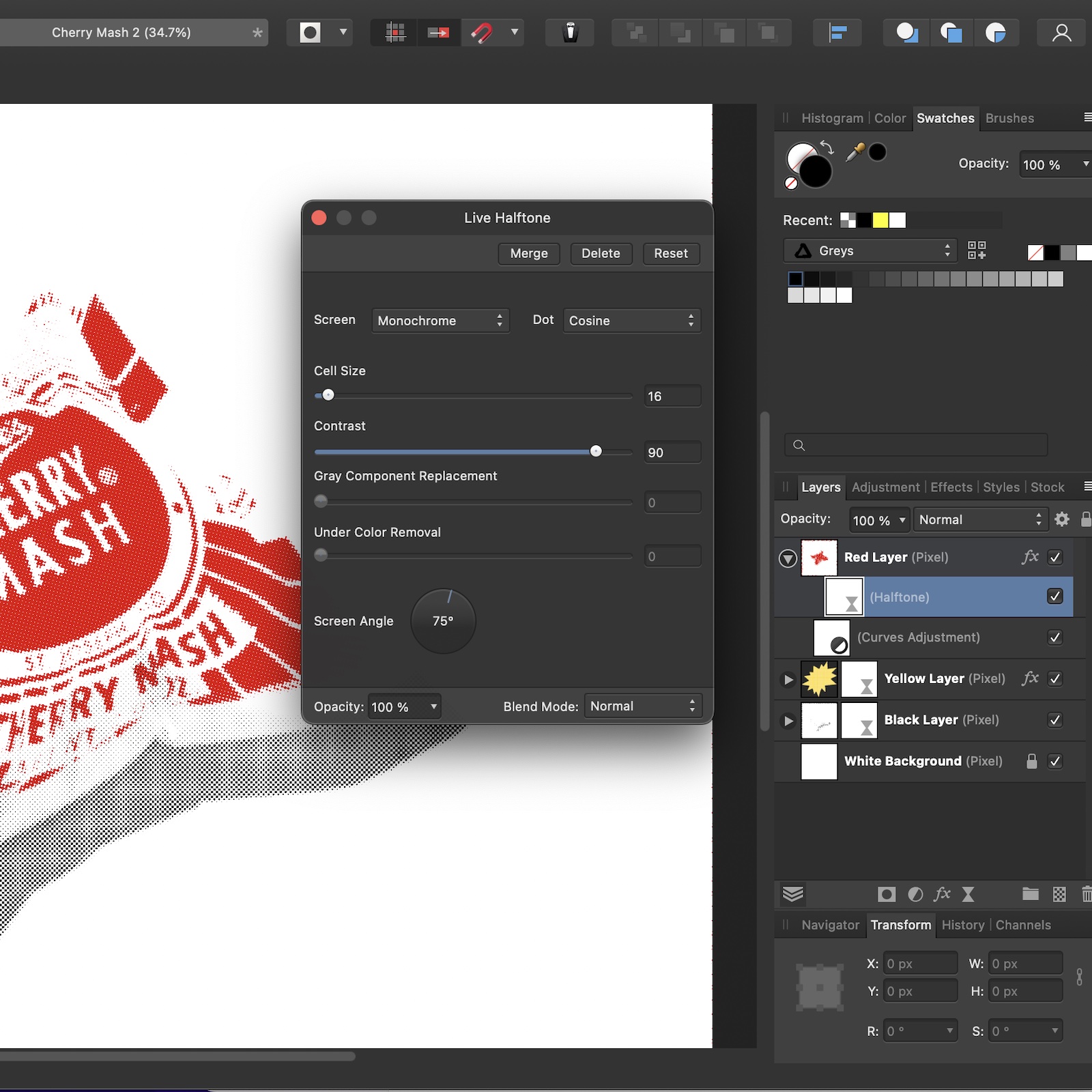
The series of photos gave me images that were pretty good to work with. For the first chroma shots I still had to separate the red and yellow but that was not too difficult. Further, I wanted no luminance in those layers either. Playing with Levels, Curves, and similar common image software controls I was able to get the desired individual red and yellow layers.
I am not a fan of renting software and so I stopped using Adobe products long ago when they started requiring a subscription. Affinity Photo (and sometimes Pixelmator) are the software I used on this project.
Cleaning up what was to be the black layer (one of the luminance photos from above) is hard when there is a kind of gradient in the background. It’s deceptive because it looks like an even white background but when you try to “magic wand” select part of it you find that only a small portion of the background is selected. Bump up the threshold of the selection and you end up grabbing part of the shadows you wanted to keep. Eventually I got it but I would like to figure out a better way in the future.
Halftone
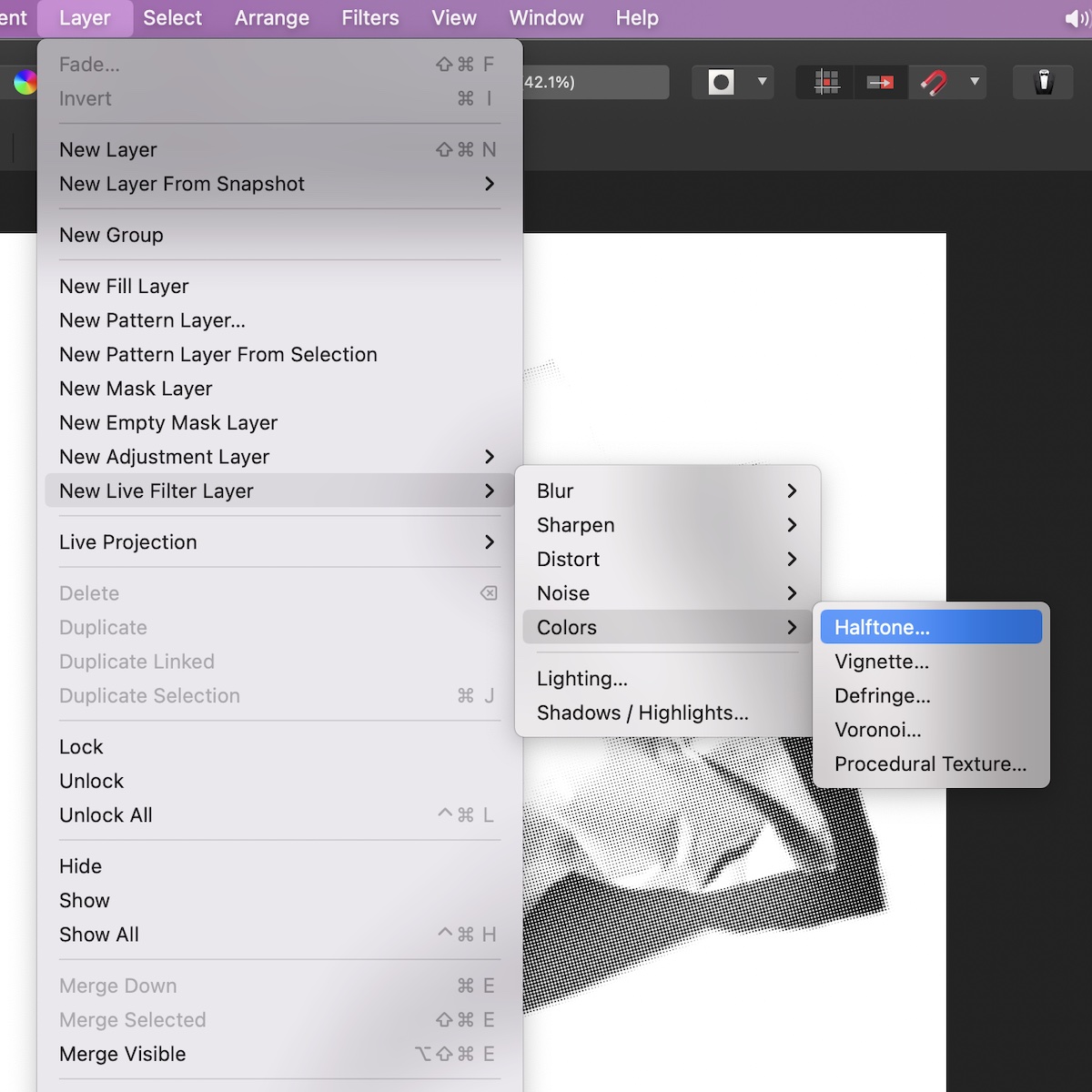
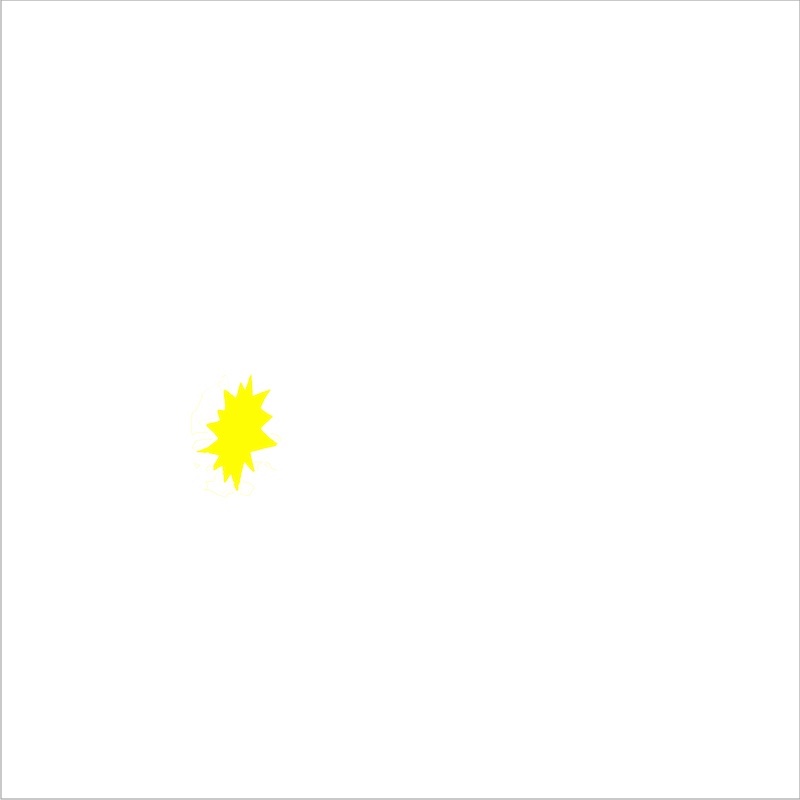
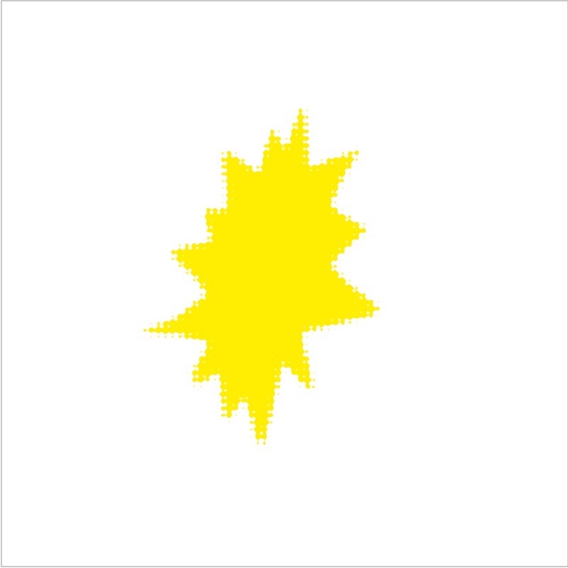
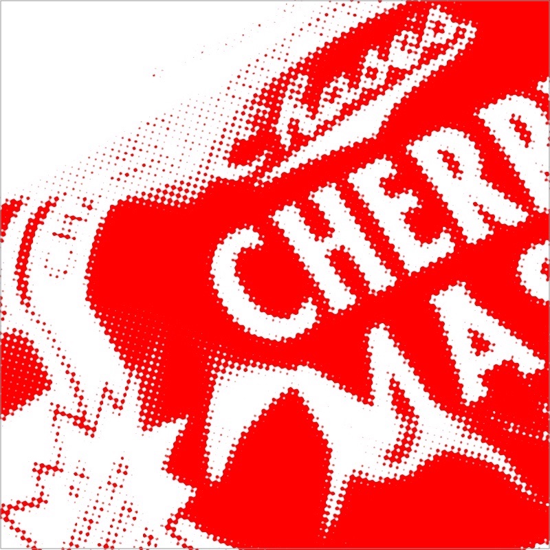
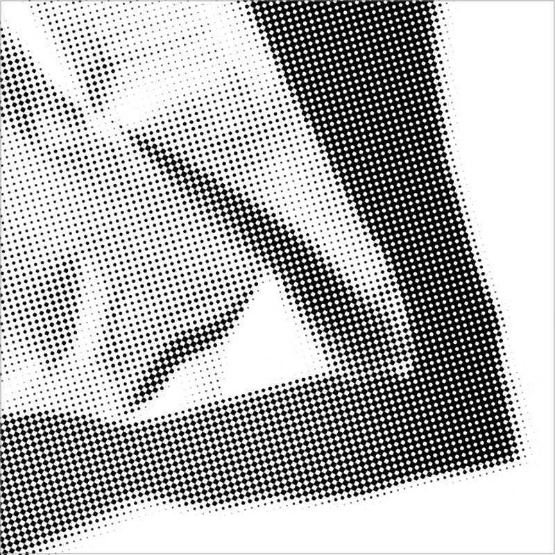
I used the halftone feature in Affinity Photo. Under Layers → New Live Filter Layer → Colors → Halftone…. Here I adjusted cell size and screen angle. Cell size was the same for all layers but each got a different screen angle. I used standard angles: I think 75 degrees for the red channel, 0 degrees for the yellow and 15 degrees for the black.
Printing
I printed the image on my Epson inkjet (a largish format printer). But rather than composite the three layers into a single image and print that, I instead printed each layer as a separate pass through the printer.
I would load up the red image on my computer and print it to a 13” × 19” sheet of paper. When done, I loaded up the yellow image and printed it to the same sheet of paper (just feed the sheet back into the printer). I followed by printing the black image last in the same manner.
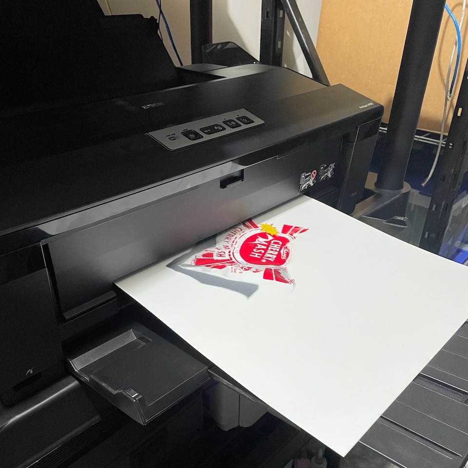
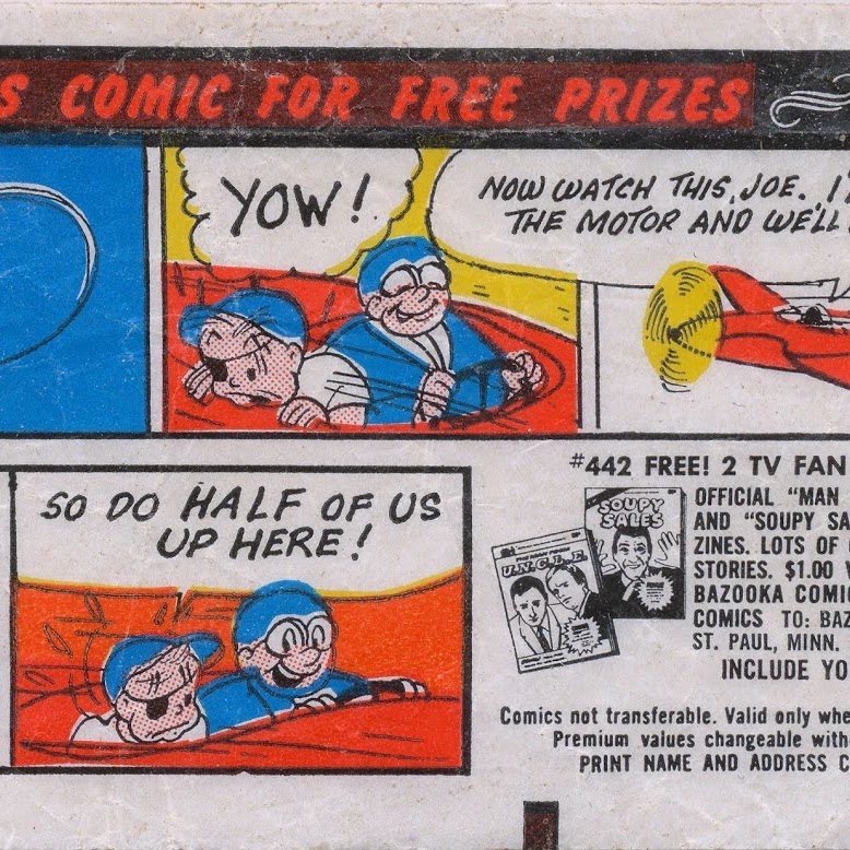
Alignment between print sessions was not a problem although I think I secretly hoped there would be some minor misalignment. It was one of the fascinating things about cheap prints like the Bazooka Joe comics that came wrapped around the bubble gum. When you saw the misaligned colors it gave you a peek into how the artwork was separated, how the printing process worked.
Conclusion
The ring light and the attempt to remove all shadow detail for the chroma photo was not a great success. The ring light itself did not get rid of all shadows as I had hoped. There is perhaps a way of using multiple light sources and carefully adjusting the intensity of each to nearly diminish the shadows — the ring light though was not a short cut to that.
But beyond that, the flat lighting, even if I had fully succeeded, would have also prevented the shine and reflection that is also a part of the luminance of the subject. When I first thought of this technique I had not appreciated that luminance is not just shadow but also highlight, reflection.
The second step worked well: painting the subject white and lighting/photographing to capture the shadow. But I think I could have dispensed with the ring light for Step 1 and simply lit it in the same manner I intended for Step 2. In post, switching to a color space that puts luminance in its own channel (like L*a*b), should still allow easy separation of the chroma.
I have some ideas for changing up the actual print process a bit as well, but that will have to wait for the next printing experiment.